iOS Parking App
Role: UX/UI Designer
Curby is an iOS app I am developing that makes parking easier in metropolitan areas. As a car owner in Brooklyn I found parking to be a frustrating experience both in terms of time spent looking for parking and confusion over parking rules and signage. Believing this to be a pain point I decided there was an opportunity to help users find suitable parking options based on their needs. The steps below outline the entire design process.
In order to empathize with our end user I started the process by formulating a hypothesis:
Parking in metropolitan areas is a pain point for many people. I believe that developing a parking app will save them time.
Next I needed to test our hypothesis to ensure the problem was valid. I conducted user interviews and looked for commonality in terms of responses. Some of the key findings where:
- Many people found parking rules confusing
- Looking for parking is time consuming and frustrating
- Many people have gotten tickets because they forgot to move their car
- People would like to know parking options they leave the house
- Park their car >3 days a week in street, metered, or garage parking
Persona
To further understand who our target audience is I synthesized these findings into a persona named "Mark".


Habits:
- Works long hours, always on the move
- Savvy mobile user
Why:
- Needs to park frequently
- Uses car for business and personal
Where:
- Parks in multiple locations
- Uses throughout the day
Mark
Part owner of 2 restaurants 42 years old
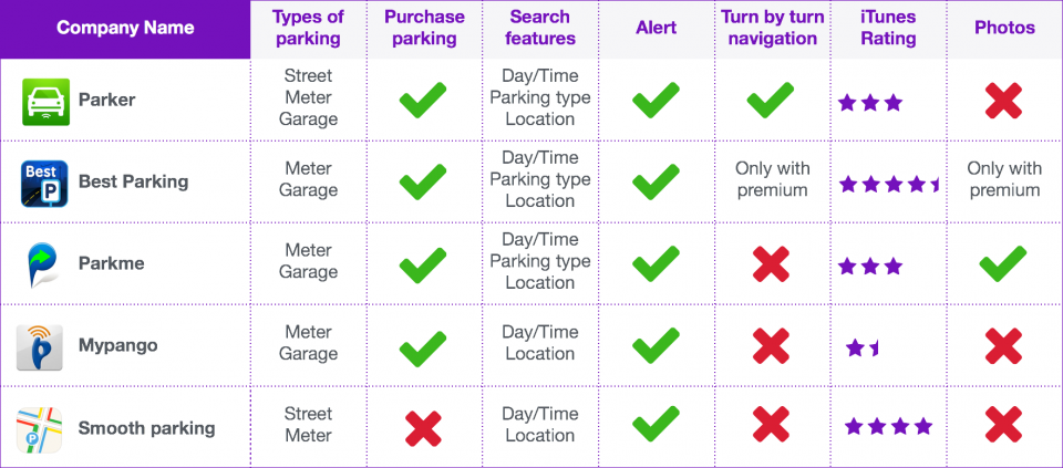
Competitive Ananlysis:
Is there a need?

Hand drawn wires and rough prototype:
Start with rough sketches to begin the design process. After several iterations I landed on a useable design and begin building a rough prototype


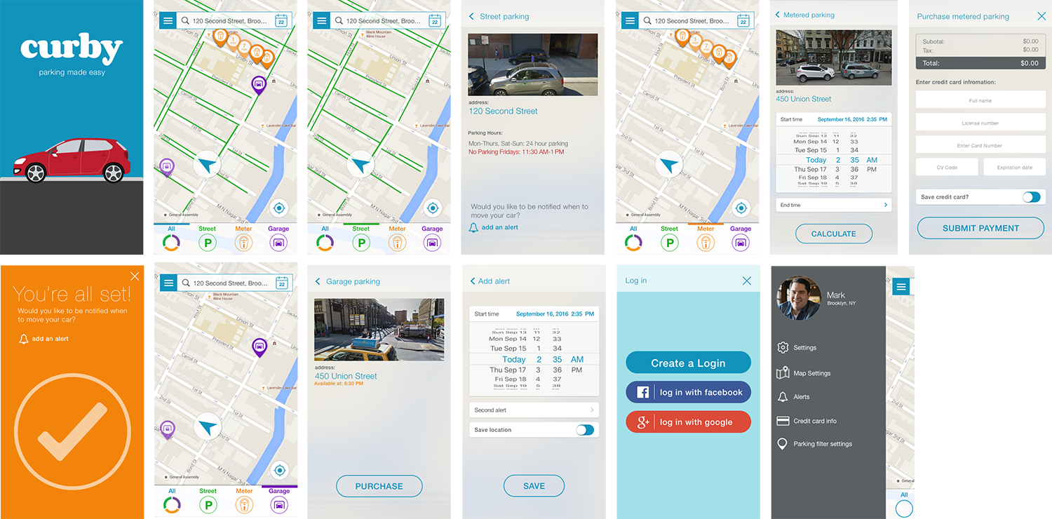
High fidelity prototype and UI
Fully flushed out UI elements, color schemes, and iconography.

