Heroes to Heroes website
AllGoodWork Hackathon
Role: User Research, Information Architecture, Visual design
Industry: Non-profit
Duration: 2 days
AllGoodWork Hackathon
Role: User Research, Information Architecture, Visual design
Industry: Non-profit
Duration: 2 days
In November 2017 I participated in UX hackathon to improve Heroes to Heroes, a non-profit veterans outreach program through spiritual and peer to peer counseling. The objective was to diagnose problem areas, employ user-centered improvements, and ultimately drive enagement.
Define what the main objectives of the site where:
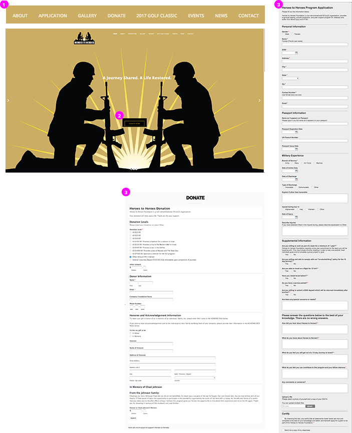
After I performed a content inventory I noticed areas for improvement where
After I performed a content inventory I noticed areas for improvement where:


My first objective was improve the findability and taxonomy of the content. I also wanted to streamline content down to what helped us achieve our goals of increasing donations and applicants. To get a sense of how I could reorganize content and create a hierarchy of information I completed a card sorting exercise.
Figure "1" represents the current site design
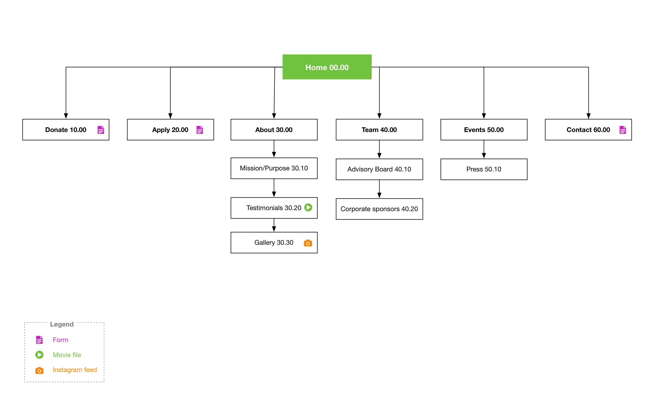
Figure "2" represents my proposed site hierarchy
I reorganized synthesized the results into a sitemap. Sections that where closer to our MVP where placed higher in site map.


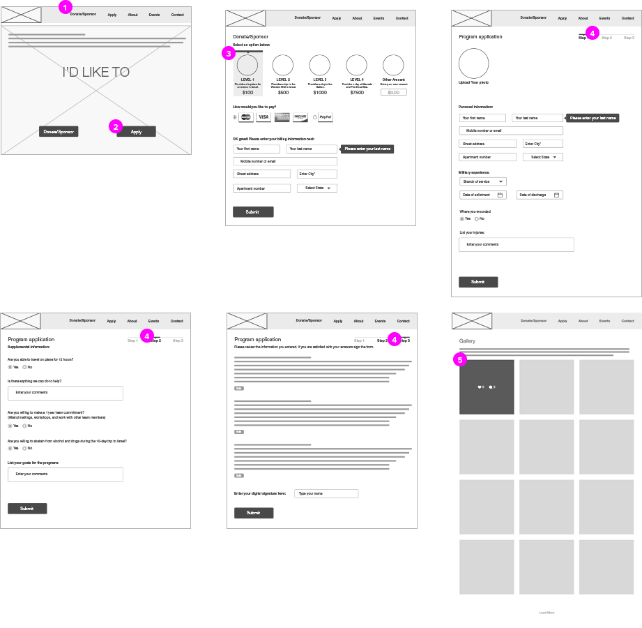
Once in wireframing I began to make improvements to the site by:


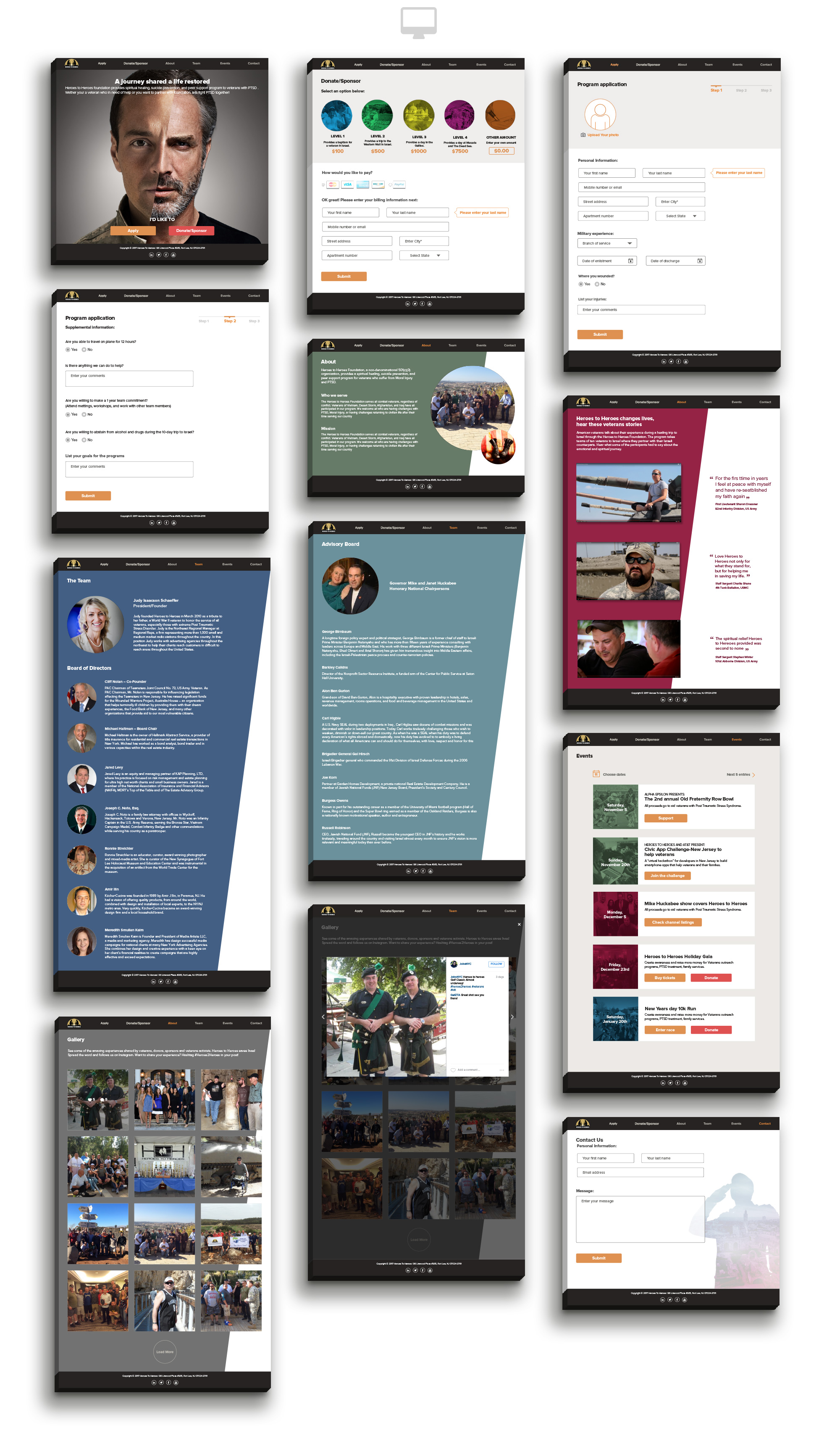
Then final design features:

